Mary Webb: Reverie

“I want the colour to set up a process of renewal where relationships change with the looking. First assumptions are confounded the longer the painting is contemplated, and this is how I like to think of them, as objects of contemplation.”[1]
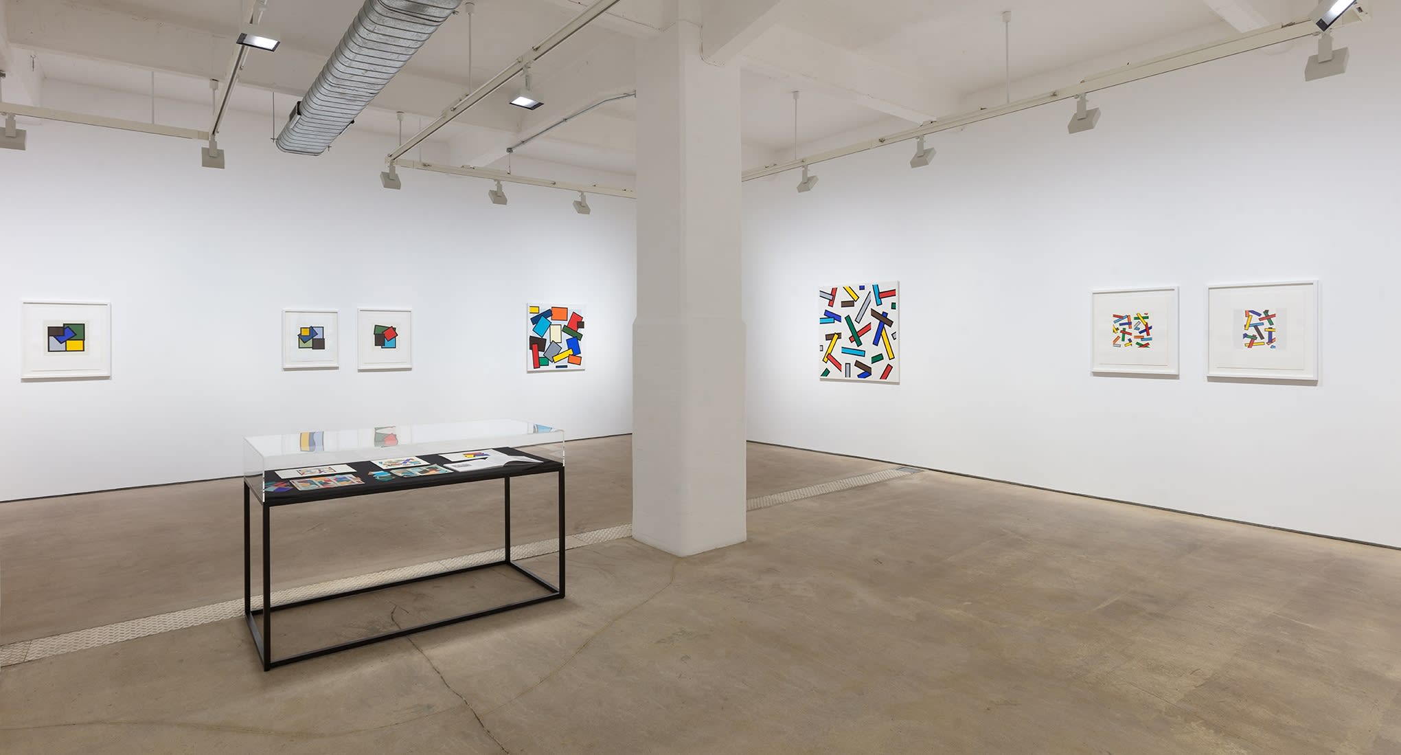
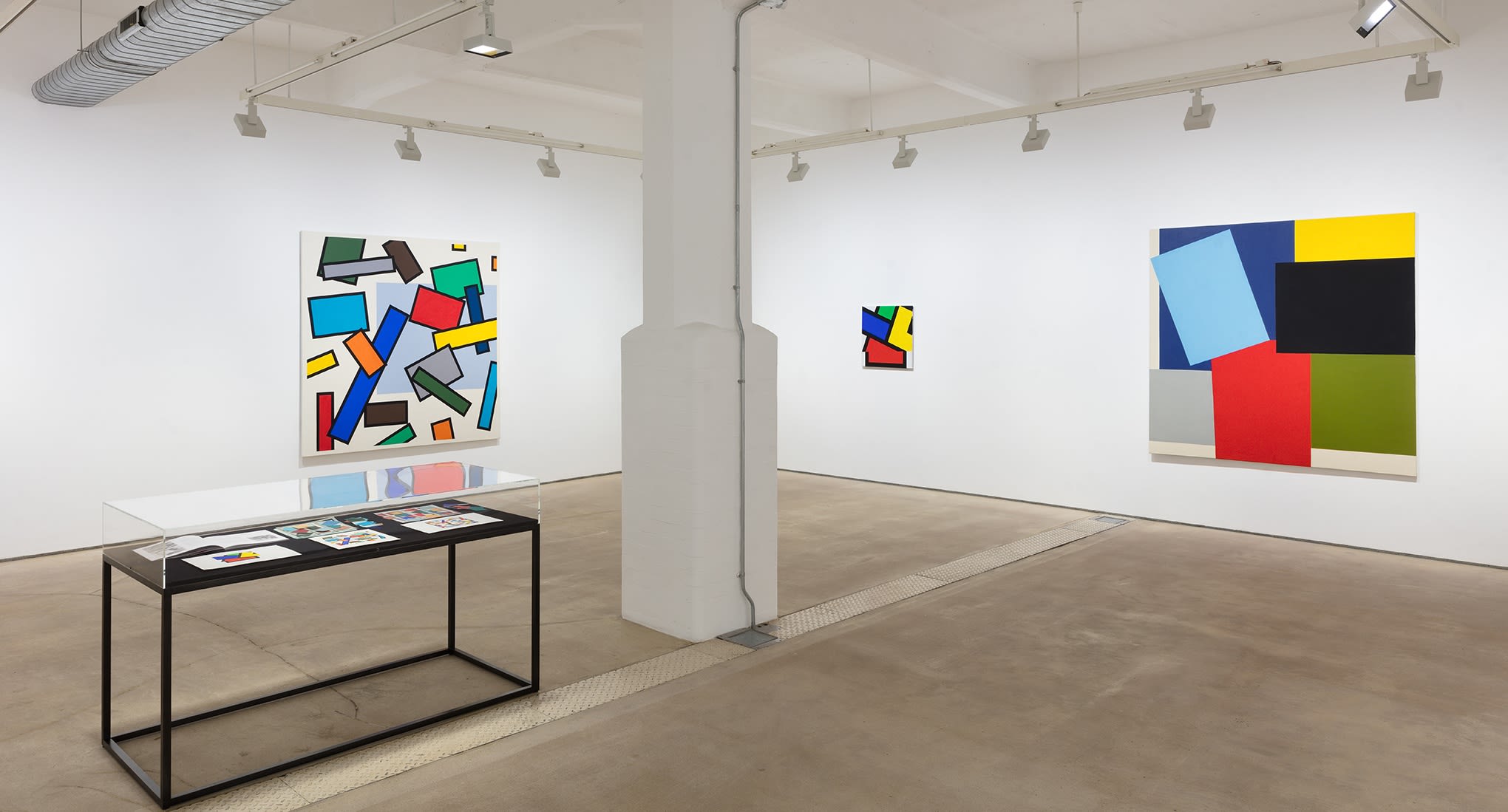
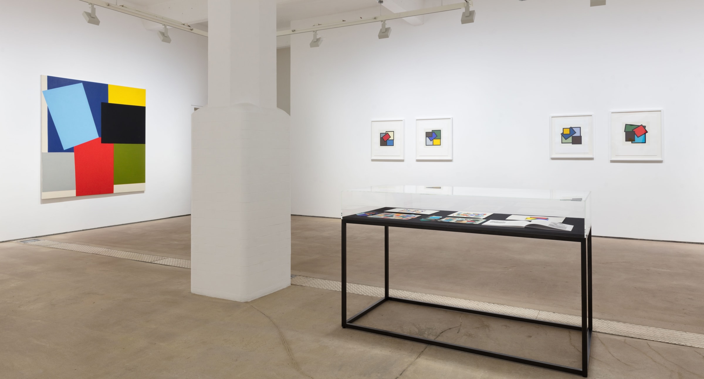
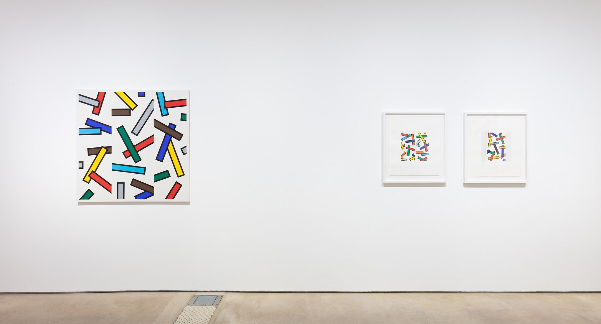
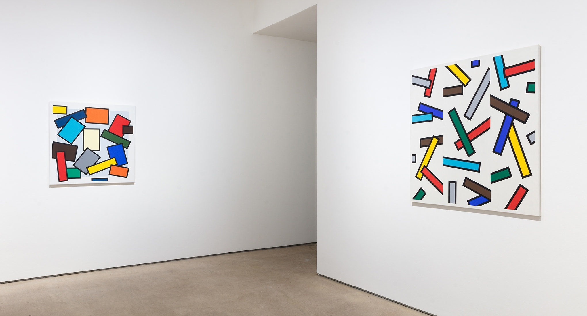
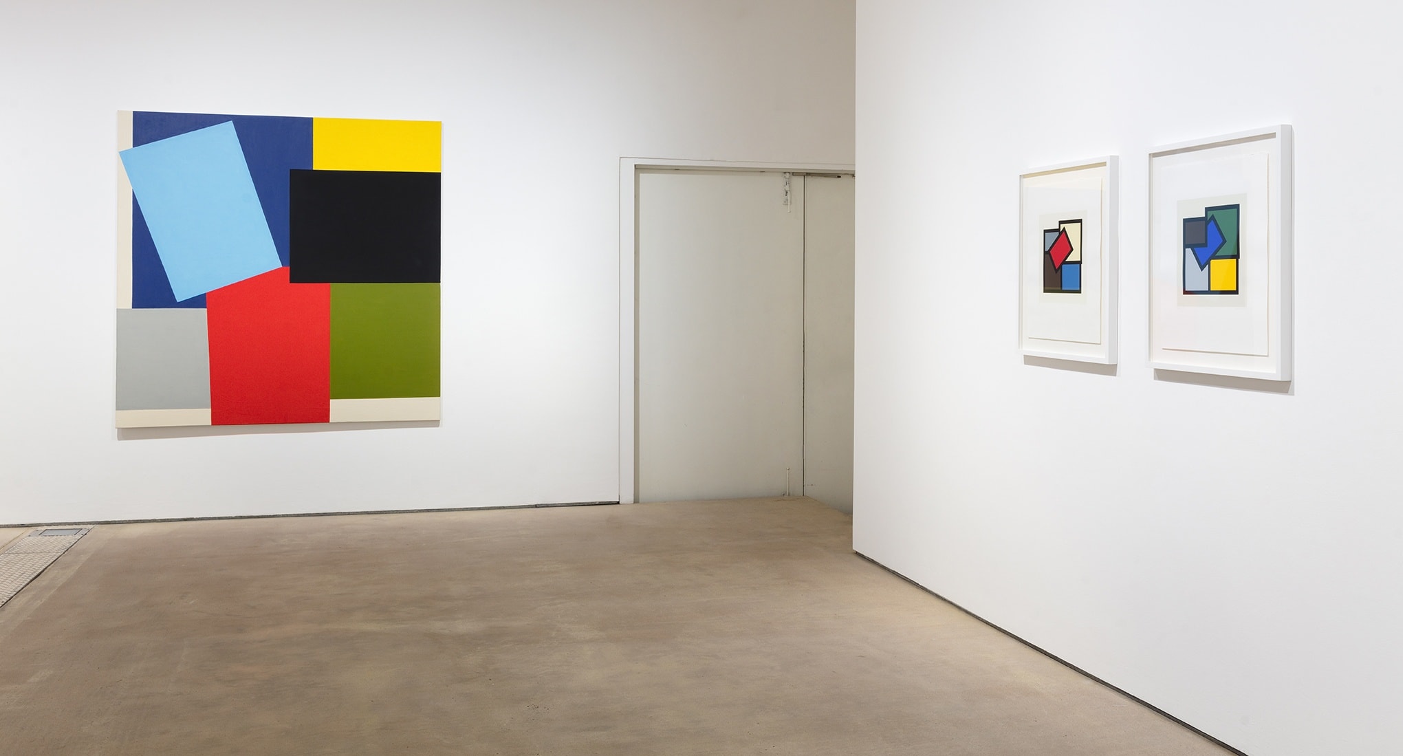
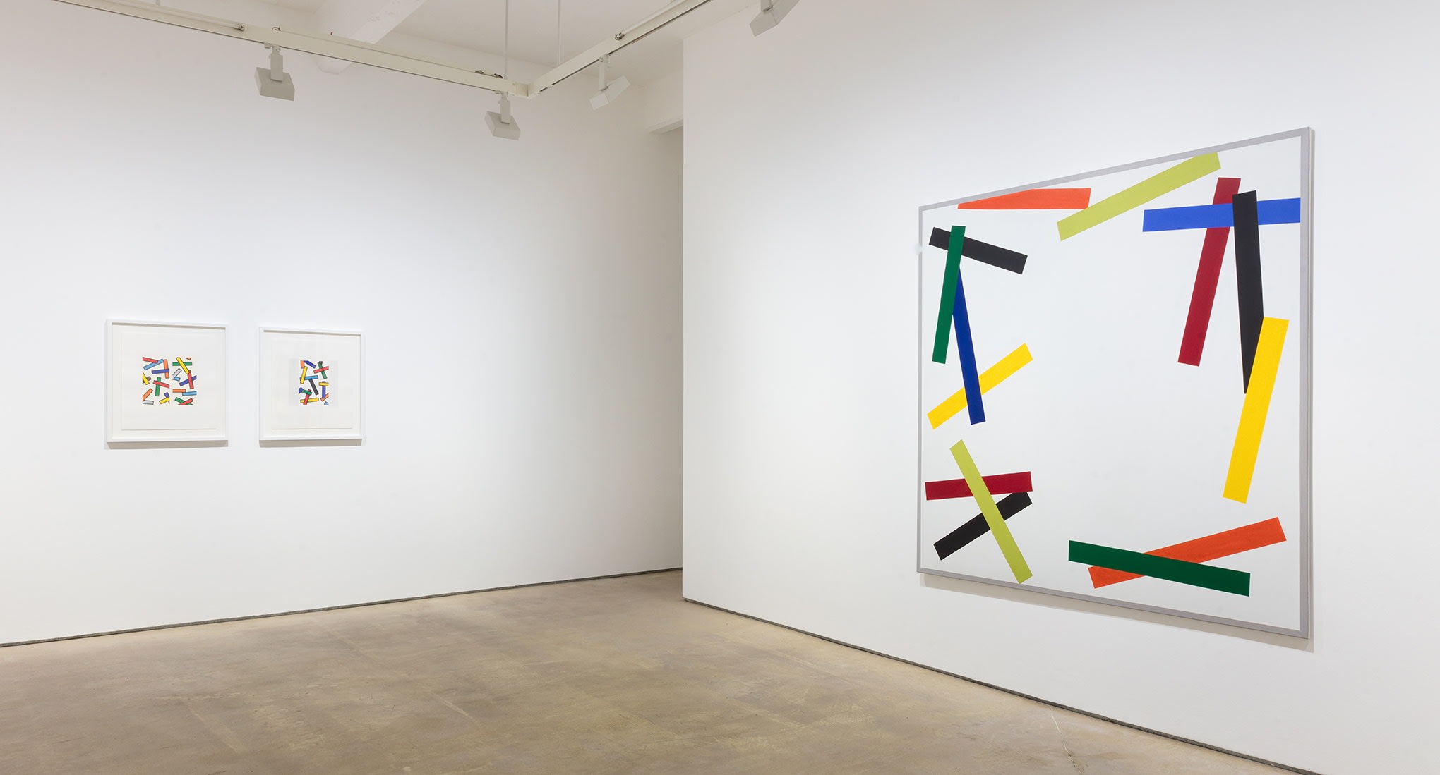
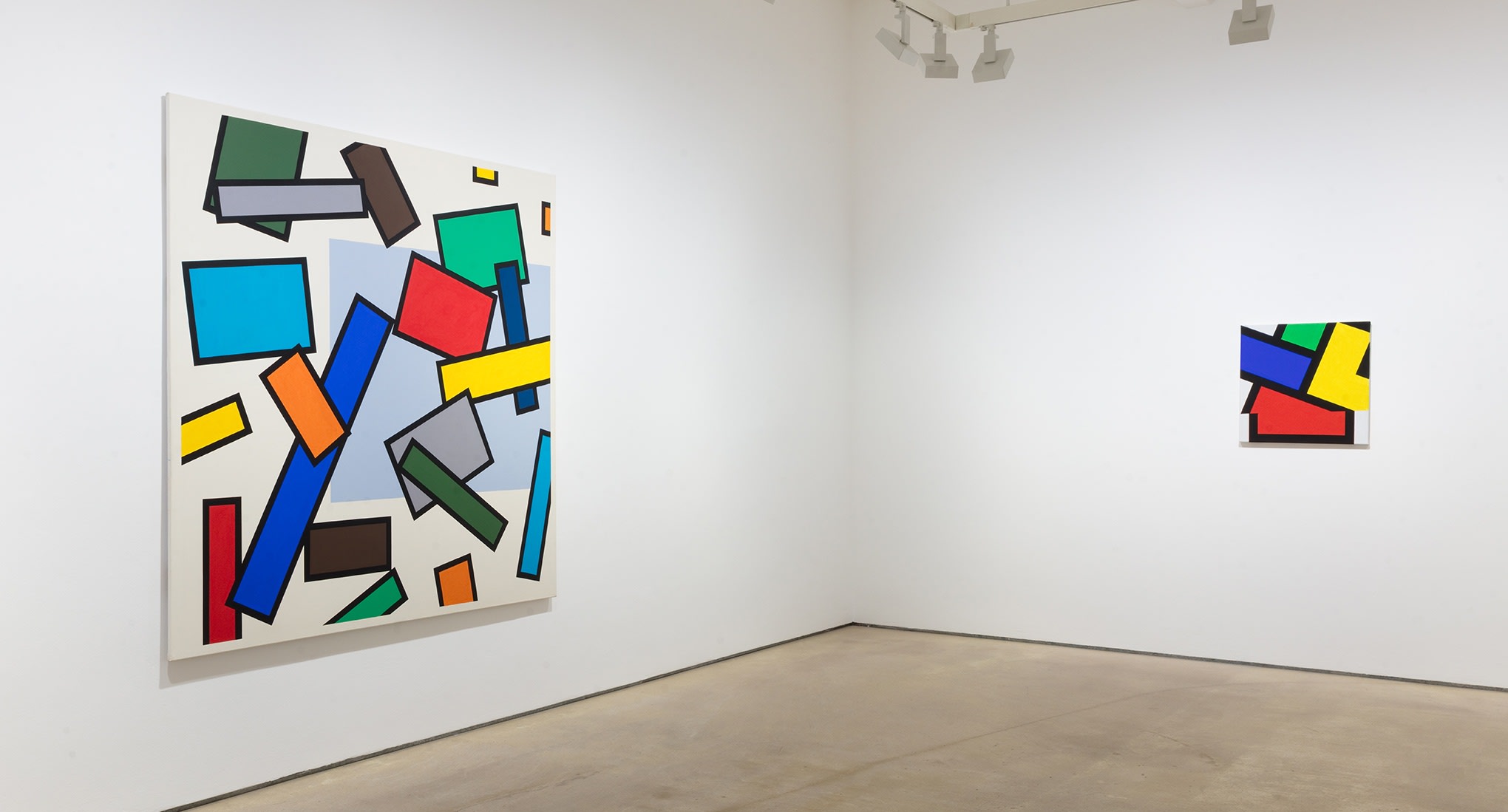
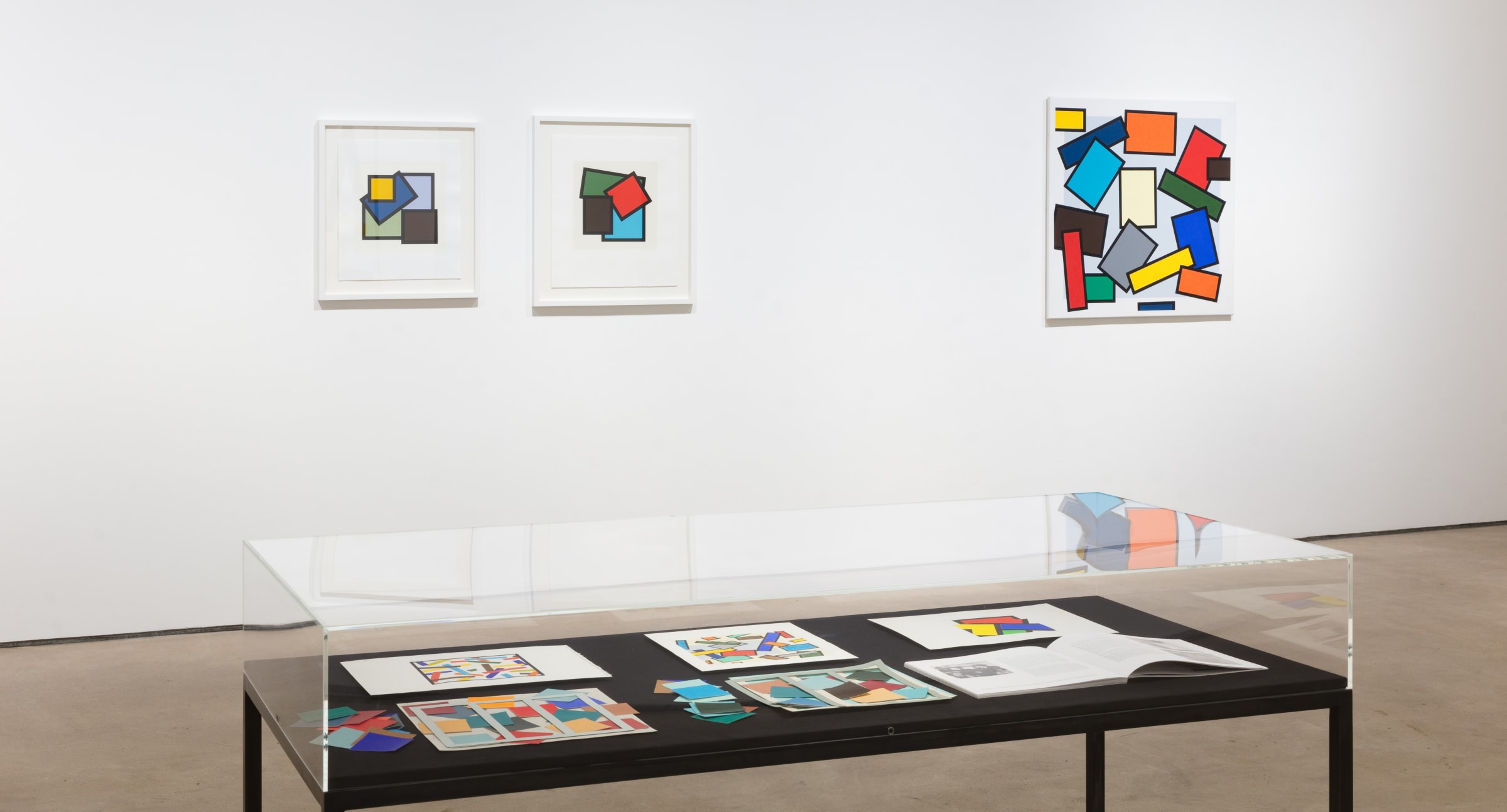
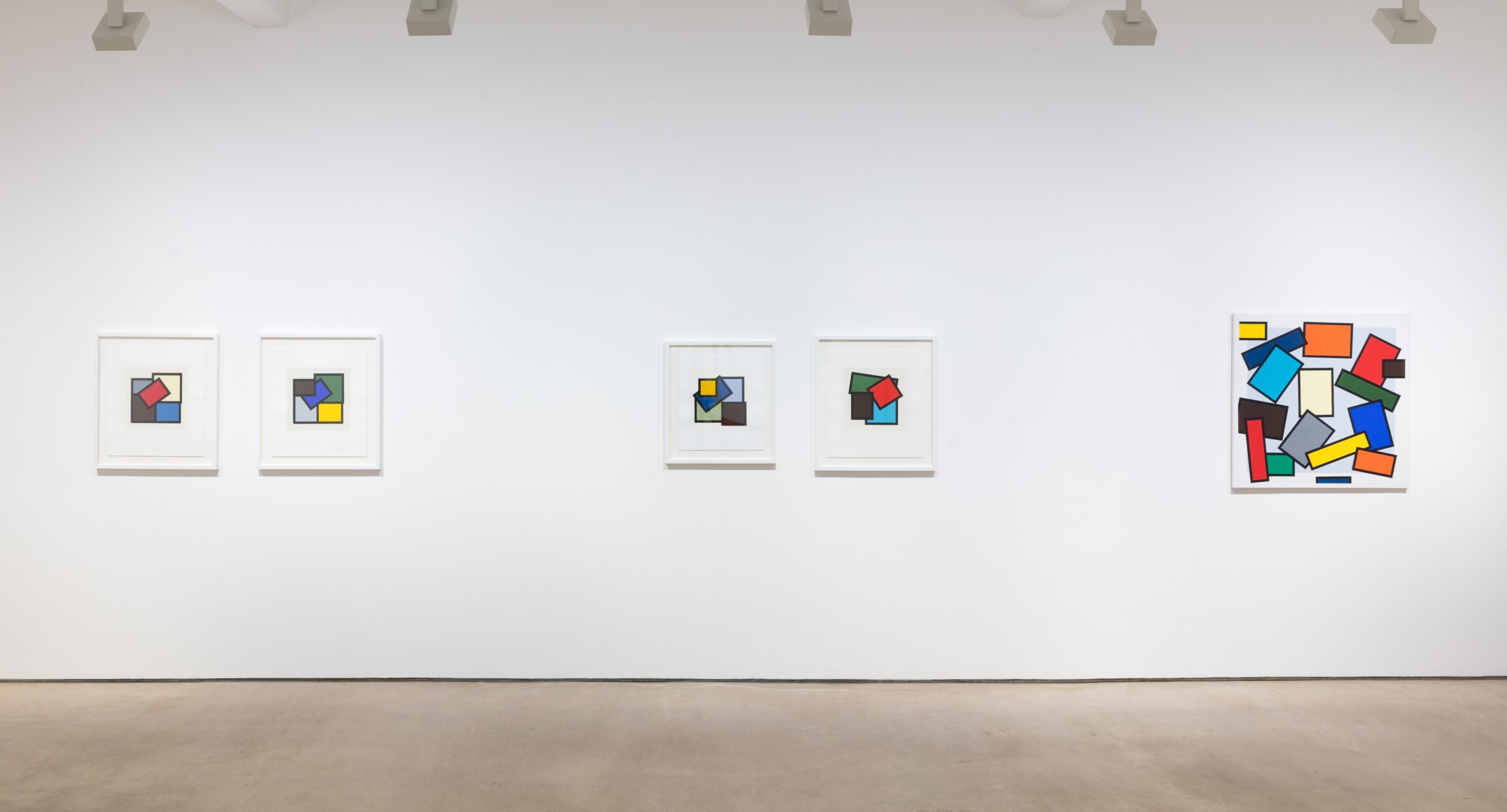
Hales is proud to announce Reverie, a solo exhibition of work by Mary Webb. Webb’s first exhibition with Hales will feature a series of paintings, prints and collages spanning two decades (1980 – 1999), united by the artist’s formal exploration of abstraction and complex interplays of colour.
Mary Webb (b.1939) studied at Newcastle University on the infamous Fine Art ‘Basic’ course run by Richard Hamilton and Victor Pasmore, before completing her postgraduate studies at Chelsea School of Art in 1964. Webb lives and works in Suffolk.
For this confident and experienced colourist, the fascination with colour began at an early age. Mary Webb describes childhood in austere, post-war Britain as lacking colour, so the artist pinpoints key moments such as borrowing bright American comics, the excitement of sitting in a dark picture house waiting for a Technicolour film to illuminate the screen, and poring over the rare colour photographs in copies of National Geographic. These formative years are crucial to a practice dedicated to the exploration of colour through painting and printmaking. Rendering the world around her as a timeless abstraction, over five decades Webb has mastered complex interplays of geometric forms and colour.
Webb’s work is part of a tradition of modernist painters employing geometry and colour theory to create a new vision of the world. While at university, she selected painter Robert Delaunay’s practice for her dissertation subject, subsequently developing a friendship with his wife and cofounder of the Orphism* movement, Sonia Delaunay, who through consistent support instilled a confidence in Webb’s use of colour. The opening statement of her dissertation is indicative of her connection to the movement: “Colour alone gives the depth, meaning and movement of everything. Felt space which is the domain of the painter is essentially coloured”[2], this sentiment not only resonates with Orphism and Simultanism,+ but can also be applied to Webb’s own ongoing practice dedicated to exploring the possibilities of colour.
Although working to create abstractions, the conception of the artist’s work is frequently rooted in the places she travels to and she often references countries or cities in the titles. Webb is so attuned to her surroundings at her studio in Suffolk that when she visits somewhere new she finds the experience “a visual shock”[3], with changes in light, landscape and architecture - down to the most subtle differences - being enough to inspire a whole body of work.
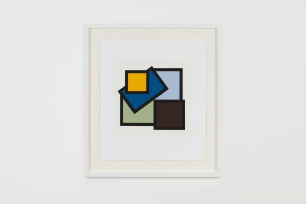
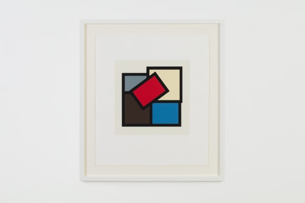
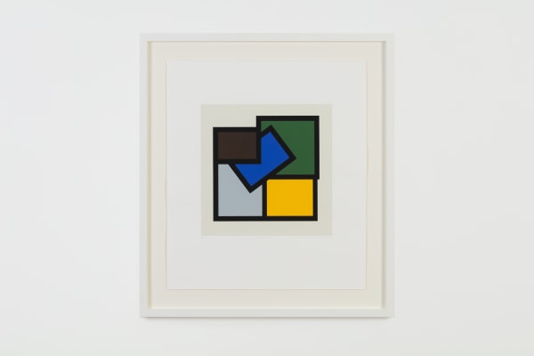
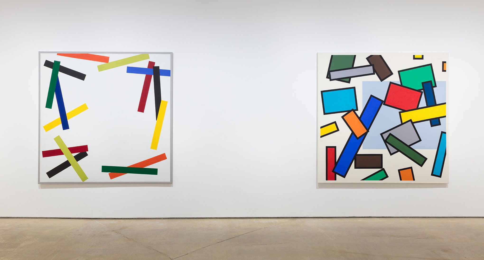
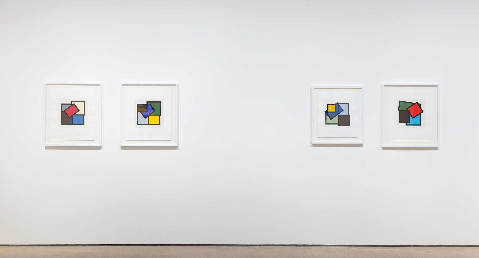
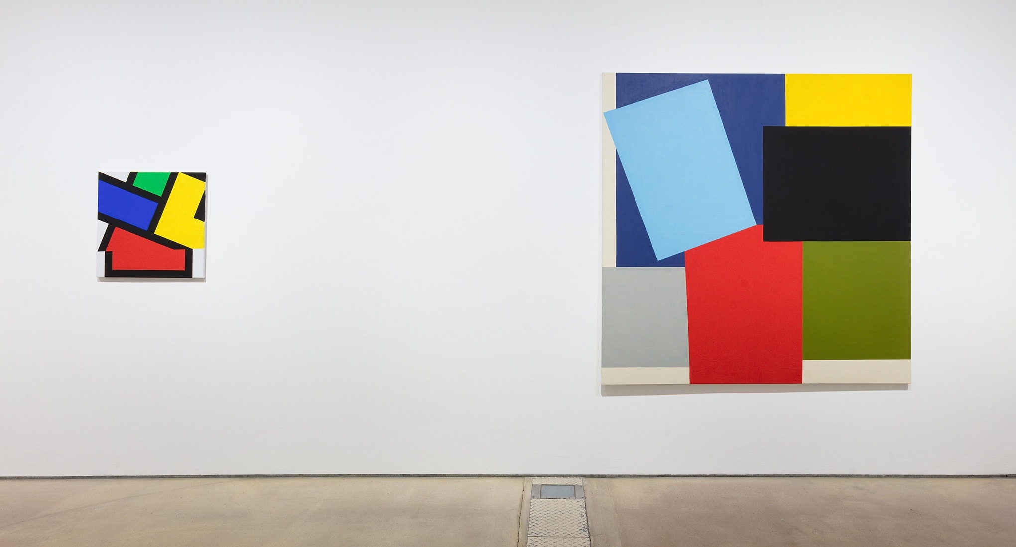
In the works exhibited in Reverie, a myriad of influences and emotions seep into the compositions and colour selections. For example, Brancaster I (1991) displays a different movement and energy compared to earlier works, evoking joy and a sense of freedom after Webb’s resignation from her teaching position of 24 years - the sense of release is palpable in the tumbling blocks of saturated colour. In contrast, the introduction of the black line in her work came after a trip to the Leger Museum in Biot, France. Fernand Leger’s use of black outlines inspired her to encase coloured blocks with black in order to see how it challenged the relationship between hues. Brignoles (1980), named after a French village she travelled to on the way back from the Leger museum, is an early example of this black demarcation, which was to become a significant element in her practice.
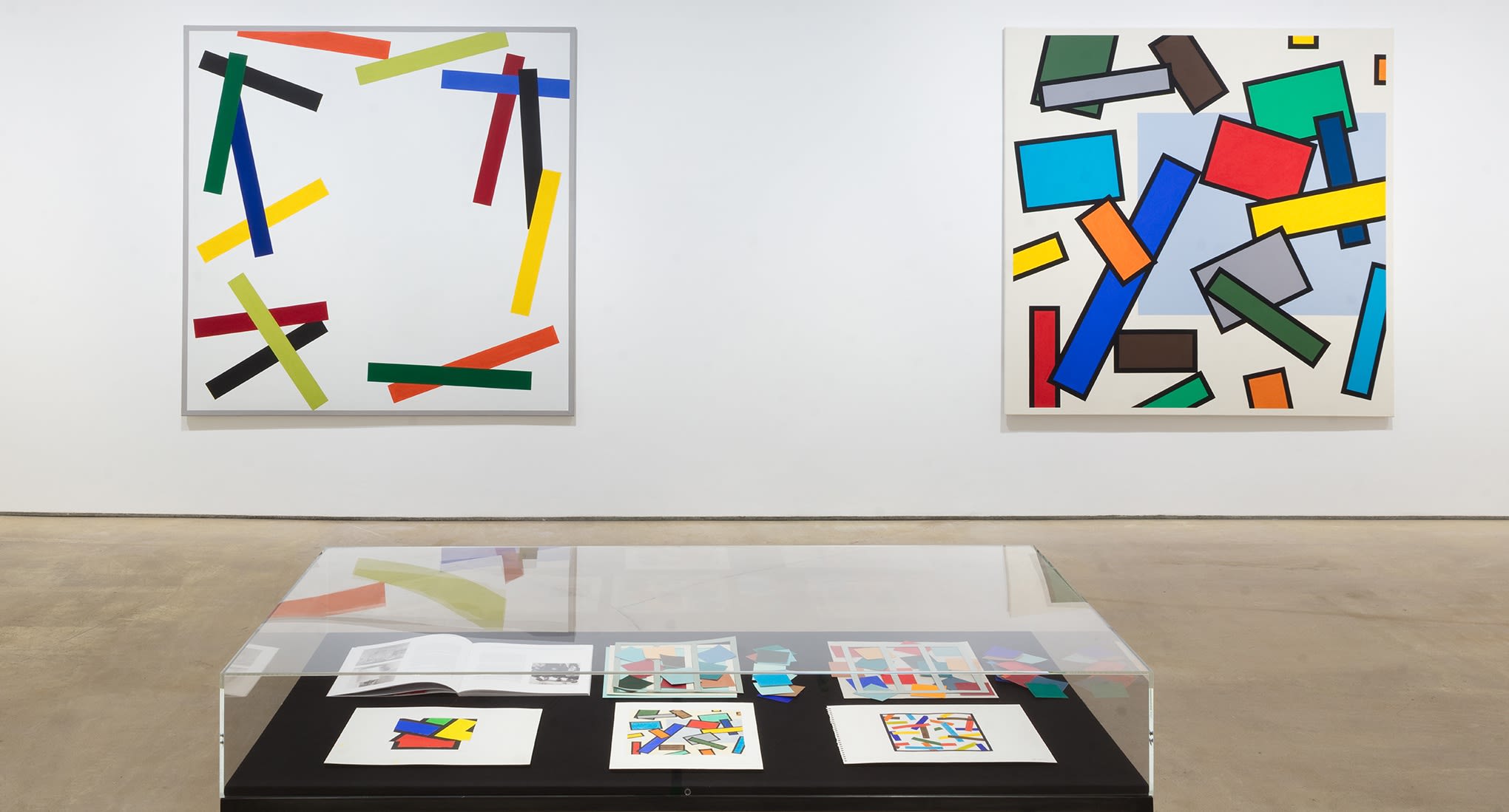
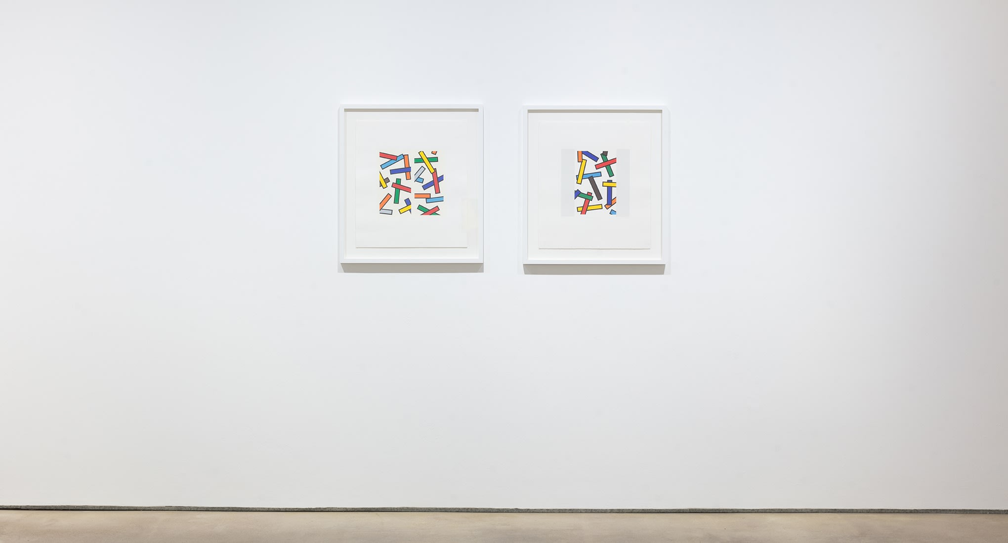
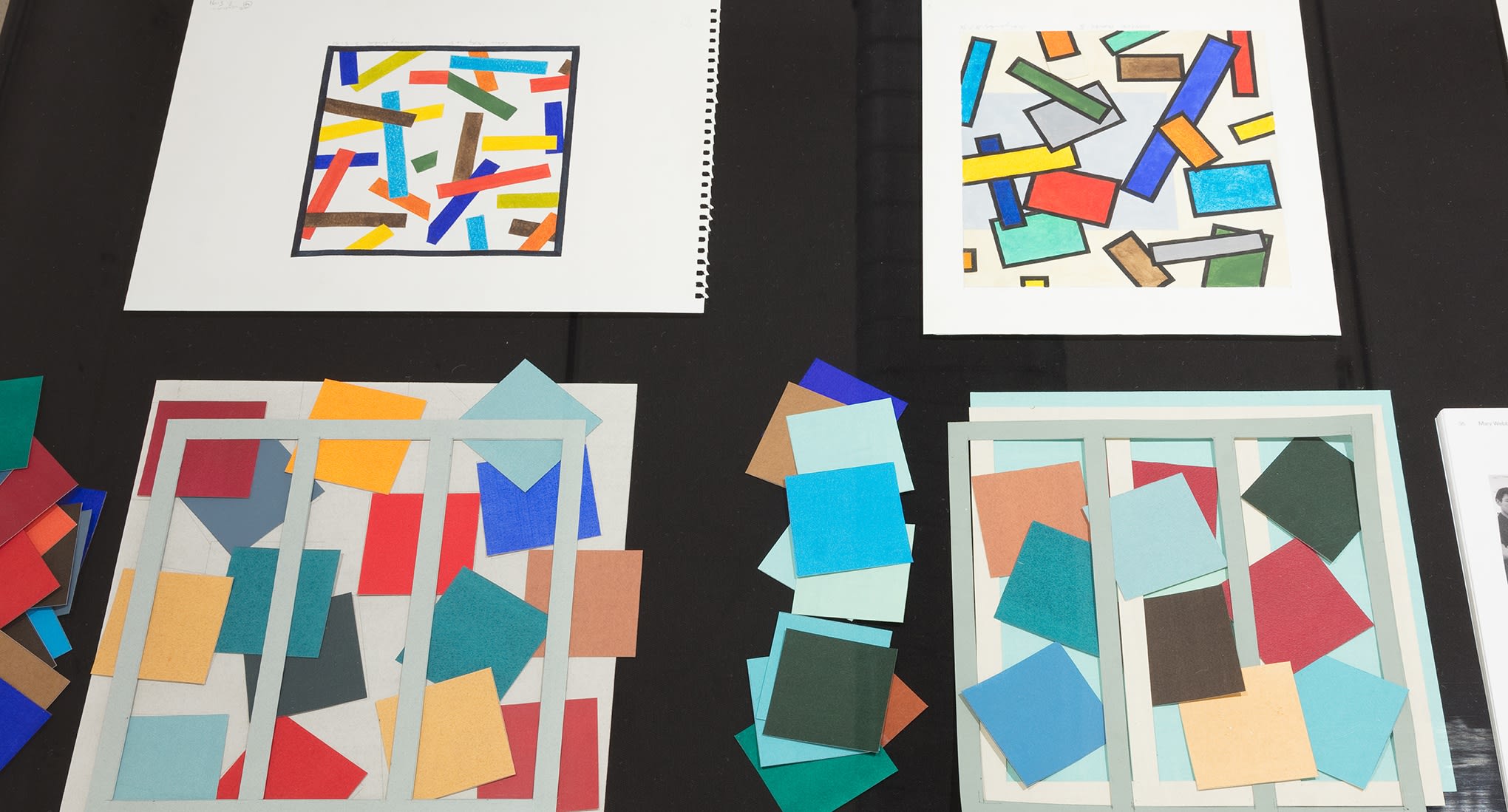
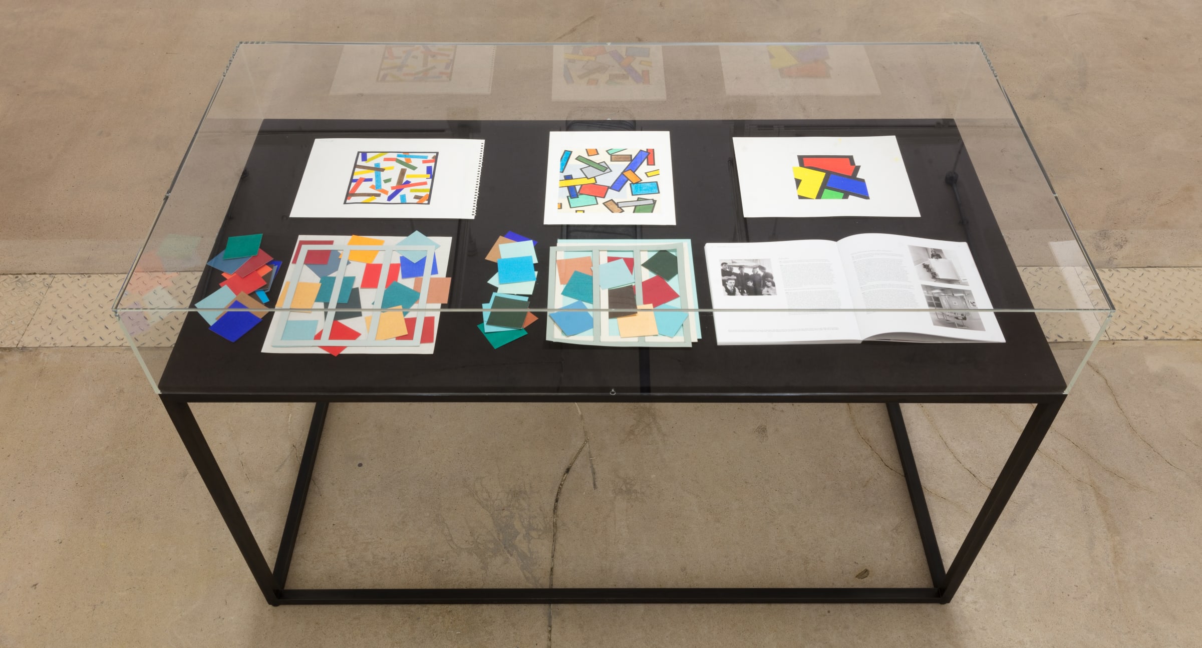
All of Mary Webb’s artworks are laboriously considered and the result of a multi-stage process. In the preliminary stages, the artist makes water colour paintings and collages using shaped pieces of paper which she pre-paints to achieve a particular colour and consistency. In her oil paintings, each piece is exactly proportioned by eye and straight edges are masked out as Webb scales up the studies to create her monumental square canvases. The artist selects specific paintings to develop into screen prints when the colours and shapes lend themselves to the precision and care of printmaking. Webb was encouraged to incorporate screen printing into her practice by fellow Norwich School of Art teacher and friend Mel Clark, whom she worked closely with for forty years. Collaborative in their approach, they would deliberate over paper quality and density of ink - Webb pre-mixing all the colours in her studio before Clark printed the images in his workshop. Using simple equipment, the exquisite colours are clearly defined with exacting precision. Now printmaking with Kip Grisham at the Print Studios in Cambridge, Webb continues to work in a way that fosters her skills as a colourist.
Meticulously planned, the works are individually strong yet also work as part of a series – Webb will continue to work in series in order to explore an overarching idea thoroughly. Not relying on colour theory texts, Webb has an innate sense for the subtle interaction between colours, striving to avoid drawing the viewer’s eye to one particular area by making the colours work together and exploring diagonal compositions, aiming for there to be an all over quality to the work.
The considered relationship between colour and form creates a serene quality to the works, providing an antidote to the fast-paced world we live in: inviting the viewer to enter a contemplative, uplifted state.
[1] Grieve, A. ‘Colour, place and memory: the art of Mary Webb’ in Journeys in Colour, (Sainsbury Centre for Visual Arts, University of East Anglia, 2011), pg 11
[2] Francastel, P. quoted in Journeys in Colour, (Sainsbury Centre for Visual Arts, University of East Anglia, 2011), pg 8
[3] Conversation with the artist 05.07.18
*an offshoot of Cubism that focused on pure abstraction and bright colours
+A term invented by Robert Delaunay to describe his work, derived from the colour theories of Michel Eugéne Chevreul, which identified the phenomenon of colours looking different depending on the colours around them.